Showing posts with label design. Show all posts

March 18, 2014

Long shadows: adding dimension to flat design


The trend toward flat design hit big in 2013 with Windows 8 ("Metro"), iOS7, and website and logo redesigns by Google and others. As part of a general move away from skeuomorphism, Adobe application design elements “flattened out” after CS5. Flat and thin may be in, partly due to hi-res screens, but a missing dimension of "long shadows" added to flat elements became popular too.
~~~~~~~~
Read the rest at Pro Video Coalition in Long shadows: adding body to flat design in After Effects.

December 11, 2010

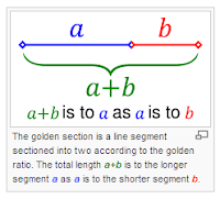
Golden Ratio preset for After Effects


James Chiny is offering a free Golden Ratio preset for After Effects at HYPOLY. It generates an overlay of a Golden spiral and rectangles using a Stroke effect. Be sure to check out his other downloadables, like his Ellipse Tool Plus preset (noted in Ellipse Tool Plus from Hypoly).

See also Lightroom's Golden Ratio & Spiral guides, an earlier AEP post with some related resources.

August 22, 2010

Apple's Design Inspiration + iTV

Kevin Rose, founder of Digg, notes Apple's design inspiration Dieter Rams and iTV. For more on iTV, see the TechMeme cluster centered on his comments [and a Yahoo article]; here's the video he posted on Apple design:

February 28, 2010

700+ pictograms, 60 free fonts, 30 vector packs

From maltaannon and others on Twitter:
For more, see the "Popular" posts of Smashing Magazine, which has made a cottage industry of these sorts of collections. One example is The Ultimate Collection Of Free Vector Packs.

Heller’s animated appraisal of Olympic pictograms

Via Motionographer is Steven Heller’s Olympic Icons: an Animated Appraisal at The New York Times website:


See also The Graphic Design Olympics (2004) by Michael Bierut at Design Observer, and another short comparison of various Olympic icons. Interesting recent work includes pictograms developed for the 2008 Summer Olympics in China by a former Adobe guy; see The Graphic Language of Min Wang.


The use of pictograms in history and in modern design is an established field of study, with major works by Henry Dreyfuss (Symbol Sourcebook), Otl Aicher, Otto Neurath, Paul Rand, Edward Tufte, and others.

A few sentences on the subject can only be inadequate. For more info, see Navigating Today’s Signs: An Interview with Mies Hora by Steven Heller and Critical Wayfinding by Ellen Lupton and J. Abbott Miller. "Modern Hieroglyphs" in Design, Writing, & Research by Lupton and Miller (excerpt pdf) makes a really cool use of pictograms in explaining pictograms in design and history.


Update: Slate has 6-part series on The Secret Language of Signs, which includes why signs are better now than they've ever been, why the signs in Penn Station are so confusing, how smarter signs could make London easier to navigate, and the international war over the exit sign.

See also How and When to Use Pictograms from Pixel Resort.

May 28, 2009

OOOii: AE, Flash, and AIR in 'Star Trek'


Lee Brimelow posted a video interview with OOOii (formerly Blackbox Digital), a company whose work includes the gesture-based interfaces for Minority Report, the information design of Enemy of the State, the immersive technologies in The Island, the power walls of Déjà Vu, and the 360º projections in the recent Star Trek.

OOOii used After Effects, Flash, and AIR for Star Trek. This is from an earlier post:

"For Star Trek, senior developer Dave August created a complete ActionScript 3 framework for compositing and sequencing various effects that was used live on the set during filming. He also created an AIR application which was used for authoring the various sequences and also to control them as the actors manipulated them."

See also related previous AEP posts, Mark Coleran on screen design, Adobe Inspire on Ironman’s HUD, and Futuristic HUDs everywhere soon.


Update: check out the UI of Space Fence, an orbit tracking system,

May 19, 2009

Color memes and schemes

As study of the Steve Hullfish book The Art and Technique of Digital Color Correction continues, more on info color keeps popping up.

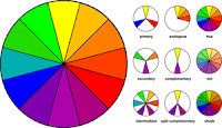
Chris and Trish Meyer have sage advice in a new series on color; see On Artbeats.com: Color Theory at PVC.

Also, TUTS+ had a nice roundup in April of Color Tools, Resources and Tutorials for Photoshopers, and (via lisaorgler) Colour Lovers has all kinds of stuff (including British spelling quirks).

There's also a few newish color design websites with nice picker tools:


The Color Scheme Designer is an online color palette picker tool with some nice nooks and crannies. The latest version sports a new interface and engine with better color space conversions and previewing, an enhanced scheme creation system, and unique scheme IDs with a permanent URL of the scheme.

ColoRotate has an intuitive interface that lets you wander in 3D color space to uncover color relationships and choose a color palette that fits your needs.

May 5, 2009

Lightroom's Golden Ratio & Spiral guides


Teh interwebs have noted The Tremendously Lazy Rule of Thirds and comments, but the most interesting tidbit so far, via tgaul, is that Adobe Lightroom has Golden Ratio/Curve guides in the Develop crop tool (hold down the o key).

There's more on the use of the Golden Ratio at Pendery.org (in Lightroom) and in Layers magazine. Layers has another tutorial, a video that shows you how to construct of the Golden Ratio and spiral; see Illustrator: Golden Section.

For tips on creating your own spirals, see the AEP post Taming the Spiral. [update: see Ellipse Tool Plus from Hypoly too]

It's a wild world, so there's no reason to get stuck on one schema. There's whole other orders of pattern available in Penrose tilings and Islamic patterns. But some roads can be too ethereal for suit everyone, like Christopher Alexander's ideas on design, complexity and order, or film editor Walter Murch's observations on the similarities of between the Pantheon, the ratio of planetary orbits, and musical scales.

January 28, 2009

Futuristic HUDs everywhere soon

The Futuristic HUD could be the next After Effects tutorial project from Videocopilot used at default settings to fill reels across the internets.

For context, see previous posts on Ironman’s HUD and Mark Coleran on screen design, as well as the AE-specific advice in A Heads-Up on Using Reticles by Chris & Trish Meyer, which uses Artbeats Reticles.

January 5, 2009

Helvetica on PBS, and Objectified

From The World's Best Gadget Designers Speak in Objectified on Gizmodo:
"As he did for Helvetica's namesake typeface, Gary Hustwit gathered the world's top designers for his forthcoming documentary Objectified, telling the story of the magic behind the objects we use every day." continue at Gizmodo...

But wait, there's more: Helvetica (noted earlier in Type casting) has its US TV premiere on PBS' Independent Lens on Tuesday night (check your local viewings here) in an hour-long version. PBS has launched a fairly extensive mini-site with loads of info, clips, and other treats if you like that sort of thing.

And here's the trailer for Objectified:

History of the internet in pictograms

The History of the internet is an animated documentary explaining the inventions from time-sharing to file-sharing, from Arpanet to Internet. The history is told with help of the PICOL icons, which are also a part of a student project by Melih Bilgil. Some icons are available for free on picol.org. (via Motiongrapher)


History of the Internet from PICOL on Vimeo.


The use of pictograms in history and in modern design is an established field of study, with major works by Henry Dreyfuss (Symbol Sourcebook), Otl Aicher, Otto Neurath, Paul Rand, Edward Tufte, and others.

A few sentences on the subject can only be inadequate. For more info, see Navigating Today’s Signs: An Interview with Mies Hora by Steven Heller and Critical Wayfinding by Ellen Lupton and J. Abbott Miller. Really cool uses of pictograms in explaining pictograms in design and history can be found in Design, Writing, & Research by Lupton and Miller (PDF).
Interesting recent work includes pictograms developed for the Summer Olympics in China by a former Adobe guy; see The Graphic Language of Min Wang (via).

October 15, 2008

Adobe Inspire on Ironman’s HUD

The Adobe XD (Experience Design) team has launched INSPIRE, a new "blog" where team members share thoughts on design and UI, gather feedback, and test Adobe technology. The topics in this experiment overlap a bit with the EDGE newsletter and Adobe Design Center.

One of the video stories on Inspire is Ironman’s HUD: A Behind the Scenes Story by Ethan Eismann, an experience designer for Thermo and AIR at Adobe. Eismann has a number of stories on Ironman on his blog. An Fxguide interview on the same topic was mentioned earlier in Behind the HUD of Ironman.

September 4, 2008

Mark Coleran on screen design

Motion.TV and Feed have an interview with Mark Coleran on screen design. Coleran's futuristic screen and UI designs appear in The Bourne Ultimatum, Children of Men, Mission Impossible 3, The Island, The Bourne Identity, Tomb Raider, Harry Potter and the Prisoner of Azkaban, and other films. He says he's doing software UI now, and it could be cool if it looked beyond Multi-Touch.

Update: Check out Mark Coleran's Flow of Visual Design for Film for even more info; there seems to be blog in the works for after Gridiron Flow ships.

Here's a Coleran reel sample from Vimeo (it works better on Vimeo).


Update: The MossyBlog has another Interview with Mark Coleran.

August 17, 2008

Digital Designers Rediscover Their Hands

"...a little-noticed movement in the world of professional design and engineering: a renewed appreciation for manual labor, or innovating with the aid of human hands."

In Digital Designers Rediscover Their Hands, the New York Times says the DIY spirit of Make magazine and Ready Made magazine has spread to corporate seminars like the one at Adobe pictured here.

June 25, 2008

State of Design 2008 Recap

In State of Design Recap, Motionographer collected some favorites that were recently presented at Promax|BDA; you get video, credits, and original postings for more background.

Also, Trapcode gallery has some nice stuff, some of which appears on Motiongrapher, like the recent Barbecue for Lexus Hybrid Drive.

April 17, 2008

Graphic Design: The New Basics


Motionographer notes a new book, Graphic Design: The New Basics by Ellen Lupton and Jennifer Cole Phillips, and its companion website (although it lacks actual motion media in the sections on motion and time). Lupton is co-author with Abbott Miller of my favorite design book, Design Writing Research: Writing on Graphic Design, edging out even Paul Rand: A Designer's Art.

Lupton's blog is also named Design Writing Research, which recommends Design Sponge as a trend-spotting resource.

Also noteworthy for actual movies (via Motionographer) is The Art of the Title Sequence.

March 4, 2008

Saul Bass website and 'Hitchcock' font


via the AE-List, starting with a Bass-like version of a Star Wars title sequence...

Saul Bass, famous for design and film titles, is still a source of inspiration. Typographica notes resources and Bass-inspired fonts, including for the Hitchcock font, at Saul Bass Website and “Hitchcock” Font Are Back.

Update: 37 Signals hosts backstory and YT clips in Title sequences from Saul Bass, the master of film title design.

November 20, 2007

28 fantastic vintage TVs

Oobject has pictures of 28 fantastic vintage tvs:

"As flat screen TVs become ubiquitous, vintage TVs look more and more interesting and unusual. From early mechanical TVs consisting of a spinning disk and lens (which look even better without an enclosure), to Sony’s original transistor TV and portable LCD sets from as early as the 80s. Here are some of our favorites from collector sites around the web." ...via Watching TV Online

They have other cool collections, like the keyboard one shown scrolling by here.

September 27, 2007

Taming the Spiral

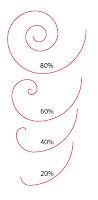
If you're into swirls, Luanne Seymour's blog discusses Taming the Spiral tool, referencing other good stuff including Swirly curls in Adobe Illustrator from Veerlr's cool blog, and Layer Magazine's Spiral Tool Mysteries - Solved!

Update: Layers magazine Tip of the Day 16 Oct 2007 adds 'Spiraling Circles,'
"Here's a cool trick that's the result of a conversation with my friend, GarySped, from the Layers Forum. Click on your Artboard with the Ellipse tool (L) and in the window that opens, make the Width 1.25". Then click on the word "Height" and fill in the same value, and then press OK. With this newly drawn circle still selected, go to Effect > Distort & Transform > Transform. In the window that opens, type in the following specs: 80% for both Horizontal and Vertical Scale; 1.0158" for both Horizontal and Vertical Move; 60 for Rotate Angle; and 25 for the Number of Copies. Now click OK to make the circle spiral. Cool trick Gary!"

Update: see also Ellipse Tool Plus from Hypoly, a preset for After Effects.