VizWorld notes 10 Stunning Science Visualizations from a few sources reporting on winners of a Science magazine and NSF challenge. Science has podcasts on this and slideshows of winners from recent years. Here's a few of the 2010 winners:
Showing posts with label information graphics. Show all posts
Showing posts with label information graphics. Show all posts
February 18, 2011
February 14, 2011
Charts and graphs in After Effects
On one level creating and animating charts and graphs in After Effects is easy, but it can get tricky quick if you go much beyond transformed shapes or the Write-On filter. Here's a few tools and tutorials that may help get you beyond the basics...
__________________________________________________
This post has been expanded and updated on Pro Video Coalition!
September 28, 2010
Visualization as storytelling
Infosthetics has some recent interesting articles including:
- Journalism in the Age of Data: Visualization as a Storytelling Medium
- Research: How Effective is Animation in Showing Temporal Trends? (see also No more excuses: a list of references to learn how to use color by the same author, and via @Coleran, Animations in User Interface Design: Essential Nutrient Instead of Eye Candy)
- David McCandless at TED on the Beauty of Data Visualization
Here's the movie from the 1st article (viewed best on the Stanford website) and some excerpts from Iron Man 2 for a jumpstart:
Journalism in the Age of Data from geoff mcghee on Vimeo.
Update: @nickvegas shares info on storytelling in How Beginners Get Better: Ira Glass Explains,
"Ira sums up in a five minute video what took me years to figure out. Follow these four rules and you will become better at what you do. Period.1. Have good taste.
2. it’s OK to suck. You will get better over time.
3. Set project deadlines to practice and get better!
4. Be patient and don’t quit. It takes a while."
2. it’s OK to suck. You will get better over time.
3. Set project deadlines to practice and get better!
4. Be patient and don’t quit. It takes a while."
Update: from Columbia Journalism Review see also Steal This Heat Map! Easy, free program to turn spreadsheets into maps and this excerpt from Data Visualization for Beginners: Notes from Geoff McGhee’s Knight Fellowship report,
"If you want the most basic, most thorough tutorial, I recommend this one by Scot Hacker of the Knight Digital Media Center, who shows how to create a visualization with free Google Charts and Gadgets, from start to finish (spreadsheet to embedded chart), called “Data Visualization for Non-Programmers.”
And for further reading: Paul Bradshaw’s mini-tutorial on The Guardian’s DataBlog,“How to Be a Data Journalist” and the follow-up on his personal blog, “Where Should An Aspiring Data Journalist Start?”, Anthony Calabrese on PBS MediaShift on the power of visualization, help forums from Hacks/Hackers, CJR’s Q&A in two parts with Chris Wilson and David Plotz on their data projects at Slate Labs, and the TED talk that David McCandless gave earlier this year on his own elegant design solutions for journalistic problems."
September 11, 2010
The NYT: a Procrustean bed of modern media
Gestalten.tv offers video podcasts on all areas of contemporary visual culture; via Twitter, here's one on visualization at The New York Times (multimedia, Lens Blog):
"How the information is manifested – through diagrams, charts, or interactive media – is up to them, though we've grown to trust their authority on all stories, from the sensitive (9/11) to the scientific (a perfect triple axel at the Olympics). In Gestalten.tv's latest podcast, we speak with Duenes and graphics editor Archie Tse on location in their New York headquarters to learn a few tricks of the trade."
See also After Effects workflow at The New York Times.
August 10, 2010
Infographic and Data Interface Videos
Information Aesthetics has collected 19 Infographic and Data Interface Videos: the Latest of the Greatest. Here's one:
// nothing_is_true from aconite on Vimeo.
July 23, 2010
Pie Chart, a custom effect preset for AE
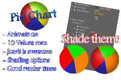 Via @aetuts is Pie Chart, a custom effect preset by Jorrit Schulte. It creates pie charts and has a variety of animation and shading options.
For similar stuff, see previous post Charts and graphs in After Effects.
July 16, 2010
Stand in the place where you are
After sorting out permissions and problems inherent in organizing free learning resources that caused blog outage, some oblique background processing is in order. Although people now use other labels like lizard brains and linchpins, Dante's vision of the cornices of Purgatory (pathological psychology) is still applicable.

Update: ah, now I remember why I posted this -- learning resources (you know who you are) have annoying bureaucracy too.
June 30, 2010
Explaining Complex Concepts with Sophisticated Infographic Animations
Information Aesthetitics notes 2 instructive movies this week in Explaining Complex Concepts with Sophisticated Infographic Animations:
"...watch The New York Times infographic animation How Mariano Rivera Dominates Hitters and learn about the differences between a 'fastball', a 'cutter' and a 'slider'. ...BP tries to inform the public about the technical details of its relief well drilling efforts, which also includes the exact video explanation BP uses internally for their own personnel currently present on their rigs. "
IA also posts favorite YouTube videos; here's one by Christobal Vila, who also did Ihsfahan (rig below), and shares tips and tutorials in Spanish on his work (Google Chrome translated automatically):
Isfahan Camera Rig from Cristóbal Vila on Vimeo.
February 28, 2010
700+ pictograms, 60 free fonts, 30 vector packs
 From maltaannon and others on Twitter:
- Pictodeck v1.0 is a deck of pictograms for Apple Keynote. It’s a collection of over 700 vector pictograms taken from four different sets: PICOL, Android Icons, Pictoico, Komodo Media, and Freshpixel.
- 50 awesome free fonts for professional design from Design Reviver
- 10 Awesome Free Handwritten Fonts from MyInkBlog
- 61 Fantabulous Fonts For Titles! from AE Tuts
- 30 First-Rate Vector Packs. Take Them. They’re FREE…. from Francesco Mugnai
Heller’s animated appraisal of Olympic pictograms
Via Motionographer is Steven Heller’s Olympic Icons: an Animated Appraisal at The New York Times website:

See also The Graphic Design Olympics (2004) by Interesting recent work includes pictograms developed for the 2008 Summer Olympics in China by a former Adobe guy; see The Graphic Language of Min Wang.
 The use of pictograms in history and in modern design is an established field of study, with major works by Henry Dreyfuss (Symbol Sourcebook), Otl Aicher, Otto Neurath, Paul Rand, Edward Tufte, and others.
A few sentences on the subject can only be inadequate. For more info, see Navigating Today’s Signs: An Interview with Mies Hora by Steven Heller and Critical Wayfinding by Ellen Lupton and J. Abbott Miller. "Modern Hieroglyphs" in Design, Writing, & Research by Lupton and Miller (excerpt pdf) makes a really cool use of pictograms in explaining pictograms in design and history.

Update: Slate has 6-part series on The Secret Language of Signs, which includes why signs are better now than they've ever been, why the signs in Penn Station are so confusing, how smarter signs could make London easier to navigate, and the international war over the exit sign.
See also How and When to Use Pictograms from Pixel Resort.

See also The Graphic Design Olympics (2004) by Interesting recent work includes pictograms developed for the 2008 Summer Olympics in China by a former Adobe guy; see The Graphic Language of Min Wang.
A few sentences on the subject can only be inadequate. For more info, see Navigating Today’s Signs: An Interview with Mies Hora by Steven Heller and Critical Wayfinding by Ellen Lupton and J. Abbott Miller. "Modern Hieroglyphs" in Design, Writing, & Research by Lupton and Miller (excerpt pdf) makes a really cool use of pictograms in explaining pictograms in design and history.
Update: Slate has 6-part series on The Secret Language of Signs, which includes why signs are better now than they've ever been, why the signs in Penn Station are so confusing, how smarter signs could make London easier to navigate, and the international war over the exit sign.
See also How and When to Use Pictograms from Pixel Resort.
January 5, 2010
Chart Wars
Information aesthetics has been tracking "chart wars," for example in Political Chart Wars: Health-Care Reform Obfuscated by Infographics, and just posted an intro video by TargetPoint's Alex Lundry:
"He addresses the issues of subjective messaging through visualization, the emergence of open data, some ideal data visualization tools, a set of quick lessons in graphic literacy, and a short list of recommended visualization books, all within the time span of 5 minutes."
Note: see also the responses to the popular National Geographic infographic chart on health care in Graphing The Cost of Health Care by Jon Peltier and Warning: Graphic Politics by Evan Falchuk.
For an overview of infographics and visualization see Interactive Narratives infographics feeds, and click on the tags below. For the on-topic angle, see Bar Graphs in After Effects and Charts and graphs in After Effects.
Update: here's a beauty that just doesn't add up -- by Fox News via Eager Eyes,
December 10, 2009
Periodic table of visualization methods

Another fun infographic is Which Countries Own America’s Debt?

December 7, 2009
Bar Graphs in After Effects
 Video Copilot has a new tutorial on making Dynamic Bar Graphs:
"In this new tutorial we will isolate bar elements from a 3D render to build a customizable bar graph in After Effects. We will use expressions to control time-remapping and link values for the displays. The tutorial is a cool 20 minutes for quick viewing and easy reference for when you get the call…"
For similar efforts, see the AEP round-up Charts and graphs in After Effects and Leveraging tools for journalists. Specky Boy has an updated survey for the websters, 25 Graph and Chart Solutions for Web Developers.
August 31, 2009
Information Visualization Manifesto [updated]
 Manuel Lima posted an Information Visualization Manifesto at his blog at Visual Complexity and it's already generated an interesting discussion.
While acknowledging a middle ground for discovery and beauty, Lima draws a distinction between information visualization and information art, which is more often vernacular eye-candy. Here are Lima's 10 directions for any project in this realm:
- Form Follows Function (not data)
- Start with a Question
- Interactivity is Key
- Cite your Source
- The power of Narrative
- Do not glorify Aesthetics
- Look for Relevancy
- Embrace Time
- Aspire for Knowledge
- Avoid gratuitous visualizations
Update: BBH Labs has some thoughts in From Art to Apps: Data Visualisation finds a purpose and “Do not glorify aesthetics”: a manifesto for Data Visualisation? See also summary of the TED re-presentation ‘Network Visualization in an Age of Interconnectedness’ – Manuel Lima Talks at BBH by Joe Fry.
Update 2: Lima takes another look at a few loose ends from his particular viewpoint and notes a Wired reference, and Robert Kosara of (eagereyes.org) looks for a new term, Not Visualization, but Visual Analysis.
Update 3: Cool Infographics notes a mash-up of Lima's main site,
"Bestario has created reMap, an interactive portal to view all of the infographics posted on VisualComplexity.com, and it's amazing. They've created semantic connection between the different infographics using tags tat allow for an incredible browsing experience."
August 8, 2009
Koblin & Lima on visualization
Also fun is the weekly Creativity Top 5 spots.
 And while his talk at TEDGlobal 2009 isn't up yet, you can look at an illustrated video interview by Digup.tv of Manuel Lima of Visual Complexity.
July 27, 2009
SIGGRAPH 2009 papers & projects online
Vizworld notes that there are ACM SIGGRAPH2009 Proceedings Online. These are the formal papers with downloadable resources. See previous AEP posts SIGGRAPH 2009 Technical Papers Video Preview and Seam carving, cloning, & cutouts for more from the projects themselves.
AEP posts never go viral but there are still about 90 projects that haven't been trumpeted, so an enterprising writer has plenty of fodder still -- check out the impressive list of 90 or more SIGGRAPH 2009 papers on the web by Ke-Sen Huang. Here's a preview of this years' papers:
BTW, SIGGRAPH 2009 is hosting an Information Aesthetics Showcase "in recognition of the increasingly prominent role that information visualization and data graphics are assuming in our digitally mediated culture."
June 17, 2009
SIGGRAPH 2009 Technical Papers Video Preview
Here's a video preview of SIGGRAPH 2009 technical papers,via davidstripinis. Some of these selections were shown in full in the recent AEP post Seam carving, cloning, & cutouts. To see more, you can check out the impressive list of 90 or more SIGGRAPH 2009 papers on the web by Ke-Sen Huang.
BTW, SIGGRAPH 2009 is hosting an Information Aesthetics Showcase "in recognition of the increasingly prominent role that information visualization and data graphics are assuming in our digitally mediated culture." For background, see AEP's Is Information Visualization the Next Frontier for Design?
BTW, SIGGRAPH 2009 is hosting an Information Aesthetics Showcase "in recognition of the increasingly prominent role that information visualization and data graphics are assuming in our digitally mediated culture." For background, see AEP's Is Information Visualization the Next Frontier for Design?
June 6, 2009
Is Information Visualization the Next Frontier for Design?
 Even though AEP's metaroundup 37+ data-visualization blogs isn't very old, there's more than enough action to merit another look even if there's some overlap. Just noticed is The power of Personal Informatics from Johnny Holland Magazine, Good Magazine's now bulging infographic collection on Flickr (via Flowing Data), and Fast Company's Is Information Visualization the Next Frontier for Design?
Of course visualization is a big, if spare & silent, part of what Google is doing with Search Options, Hot Trends, etc. And while you've been able to visualize user activity live on Digg Labs for 2 years or so, they have expanded their offerings too. Mashable has covered some of this in roundups of visualization tools for social media: 16 Awesome Data Visualization Tools, Data Visualizations: 5 Beautiful Social Media Videos, and 6 Unique Twitter Visualizations.
Since some information is best conveyed in motion, Mashable also noted 7 Beautiful Data Visualizations (With Videos). Below is one example from Skyrails, a social network visualization system that can be used to visualize any data.
At one point the AE filter Useful Things from Profound Effects could help with data visualization, even with live data from the Internet (weather, etc.), but the technology was sold to SONY. Let's hope that Adobe's Office 2.0 Mashup isn't lost forever (unlikely given the momentum of Flash, Flex, and AIR) and that the AE team is interested in this area, even if it just means easy integration with Flash.
Update: Programmable Web News has categories for both visualization and mapping.
Update 2: SIGGRAPH 2009 is hosting an Information Aesthetics Showcase "in recognition of the increasingly prominent role that information visualization and data graphics are assuming in our digitally mediated culture."
Update 3: Keith Lang recommends Information Visualization, Second Edition: Perception for Design
Update 4: Check out InfoGraphic Designs: Overview, Examples and Best Practices.
Update 5: (July) see A pseudo-random collection of Information Visualization links from Generator X and Art Against Information: Case Studies in Data Practice on Fibre Culture, as well as blogs Ben Fry, Data is Nature, Jer Thorp's blprnt.com, Pete Search's Only Connect, and Robert Hodgin's Flight 404.
Update 6: (November) CNN noted the growth of visualization in A new way of looking at the world.
May 21, 2009
37+ data-visualization blogs

For those who find these sorts of visualizations compelling, there are many resources to explore, and Flowing Data runs many of them down in 37 Data-ish Blogs You Should Know About. If you visit be sure to catch information aesthetics, Strange Maps, Visual Complexity, Datavisualiztion.ch, and Visual Mapping.
Also handy is Interactive Narratives infographics feed.
 Other good roundups include Smashing Magazine's 2-year old Data Visualization: Modern Approaches and ReadWriteWeb's The Best Tools for Visualization. More related notes and links were posted earlier at John Nack on Adobe , in Ethan Eismann's Information Design series of posts, and here at AEP.
Finally here's a nice video about mind mapping via Visual Mapping:
Update: Check out "Designing for Big Data" by Jeff Veen from Web2ExpoSF '09 , below,
February 12, 2009
Hotspots for After Effects
While it's unlikely that After Effects will rise to the top of Digg, Twitter, or Google Hot Trends, a search on Google Insights can be fun. Searching for "after effects" shows interesting trends -- like the popularity of Video Copilot and Trapcode Particular.
Here's snapshots of Google searches in the last year by Region and City; oddly the Philippines leads in the volume of increased interest as a region, and there's a rising interest among Russian speakers.


Here's snapshots of Google searches in the last year by Region and City; oddly the Philippines leads in the volume of increased interest as a region, and there's a rising interest among Russian speakers.
Subscribe to:
Posts (Atom)