Showing posts with label visualization. Show all posts

November 23, 2014

Making sound visible through Cymatics


Cymatics, the study of wave phenomena (often of material media on a vibrating substrate), was popularized by Swiss MD Hans Jenny (1904-1972). Though often discussed in the context of "new age" ideas, DIY techies and artists have expanded interest in the phenomena.

There's more at PVC in Making sound visible through Cymatics. For now, here's a recent example of cymatics from Nigel Stanford, Ferro Fluid:


February 18, 2011

2010 Science & Engineering Visualizations

VizWorld notes 10 Stunning Science Visualizations from a few sources reporting on winners of a Science magazine and NSF challenge. Science has podcasts on this and slideshows of winners from recent years. Here's a few of the 2010 winners:


February 14, 2011

Charts and graphs in After Effects

On one level creating and animating charts and graphs in After Effects is easy, but it can get tricky quick if you go much beyond transformed shapes or the Write-On filter. Here's a few tools and tutorials that may help get you beyond the basics...
 __________________________________________________

This post has been expanded and updated on Pro Video Coalition!


January 21, 2011

Subblue's real time WebGL 3D fractal explorer

Subblue is featured in a recent article from Fast Company's Co.Design, Tom Beddard Grows Fractals Into Works of Art. He had been churning out free Pixel Bender filters intended for exploration and animation in After Effects CS4+. These free filters include the Droste Effect, Fractal Explorer, 4D fractal ray tracer, 3D Mandelbulb fractal, and Little Planets.

Co.Design, which has many more interesting articles, writes that Beddard is now working on:
"bringing his tools to the masses, putting the finishing touches on an open-source web application called ShaderLab which he plans to release within a few weeks. With ShaderLab, anyone will be able to generate 3-D fractal forms and interact with them in their web browser."
Here's a video generated [with a GLSL shader in AE, see comments] like you could produce with Beddard's real time WebGL 3D fractal explorer:

January 12, 2011

Silk: an experiment in generative art + Tone Matrix

Jeff Almasol noted Silk, an experiment in animated generative art by Yuri Vishnevsky, a college student. It's simple but elegant, and headed to iOS. There are shortcuts for more functionality, like hitting the S or X key, or E, which generates a thumbnail of the picture which can then be saved as a PNG for compositing on black.

It's not so different from Flame Painter. Too bad that the open source AE Flame plug-in is stuck in CS4 (see Neosapien and Flam3); a JDI day for an AE script or Pixel Bender version of Silk would be cool though.

Silk is sort of the visual analogue of Tone Matrix by Andre Michelle (and by extension iNudge and various other time-sucks).

September 28, 2010

Visualization as storytelling

Infosthetics has some recent interesting articles including:
Here's the movie from the 1st article (viewed best on the Stanford website) and some excerpts from Iron Man 2 for a jumpstart:


Journalism in the Age of Data from geoff mcghee on Vimeo.

Update: @nickvegas shares info on storytelling in How Beginners Get Better: Ira Glass Explains,

"Ira sums up in a five minute video what took me years to figure out. Follow these four rules and you will become better at what you do. Period.
1. Have good taste.
2. it’s OK to suck. You will get better over time.
3. Set project deadlines to practice and get better!
4. Be patient and don’t quit. It takes a while."


"If you want the most basic, most thorough tutorial, I recommend this one by Scot Hacker of the Knight Digital Media Center, who shows how to create a visualization with free Google Charts and Gadgets, from start to finish (spreadsheet to embedded chart), called “Data Visualization for Non-Programmers.”

And for further reading: Paul Bradshaw’s mini-tutorial on The Guardian’s DataBlog,“How to Be a Data Journalist” and the follow-up on his personal blog, “Where Should An Aspiring Data Journalist Start?”, Anthony Calabrese on PBS MediaShift on the power of visualization, help forums from Hacks/Hackers, CJR’s Q&A in two parts with Chris Wilson and David Plotz on their data projects at Slate Labs, and the TED talk that David McCandless gave earlier this year on his own elegant design solutions for journalistic problems."

September 11, 2010

The NYT: a Procrustean bed of modern media

Gestalten.tv offers video podcasts on all areas of contemporary visual culture; via Twitter, here's one on visualization at The New York Times (multimedia, Lens Blog):

"How the information is manifested – through diagrams, charts, or interactive media – is up to them, though we've grown to trust their authority on all stories, from the sensitive (9/11) to the scientific (a perfect triple axel at the Olympics). In Gestalten.tv's latest podcast, we speak with Duenes and graphics editor Archie Tse on location in their New York headquarters to learn a few tricks of the trade."

See also After Effects workflow at The New York Times.

June 30, 2010

Explaining Complex Concepts with Sophisticated Infographic Animations

Information Aesthetitics notes 2 instructive movies this week in Explaining Complex Concepts with Sophisticated Infographic Animations:

"
...watch The New York Times infographic animation How Mariano Rivera Dominates Hitters and learn about the differences between a 'fastball', a 'cutter' and a 'slider'. ...BP tries to inform the public about the technical details of its relief well drilling efforts, which also includes the exact video explanation BP uses internally for their own personnel currently present on their rigs. "

IA also posts favorite YouTube videos; here's one by Christobal Vila, who also did Ihsfahan (rig below), and shares tips and tutorials in Spanish on his work (Google Chrome translated automatically):


Isfahan Camera Rig from Cristóbal Vila on Vimeo.

June 8, 2010

SIGGRAPH 2010 papers & previews

ACM SIGGRAPH 2010 is being held July 25-29 in Los Angeles. There's a list of technical papers on the site, along with a media news blog and YouTube channel with extra videos.

Ke-Sen Huang keeps a list of SIGGRAPH papers with links to the projects (and an icon if video is available).


Note: last year's crop was noted in SIGGRAPH 2009 Technical Papers Video Preview and SIGGRAPH 2009 papers & projects online.

May 20, 2010

Data Baby & beyond


A few month ago AEP noted some background on Data Baby, a generative graphics spot from IBM. More of the background is fleshed out by Ian Failes of Vfxblog in his Fxguide interview with visual effects supervisor John Fragomeni and art director Angela Zhu.

Coincidentally, Mitchell Whitelaw considers the same series of commercials at his blog This Teeming Void in This is Data? Arguing with Data Baby.

"Data does not just happen; it is created in specific and deliberate ways. It is generated by sensors, not babies; and those sensors are designed to measure specific parameters for specific reasons, at certain rates, with certain resolutions. Or more correctly: it is gathered by people, for specific reasons, with a certain view of the world in mind, a certain concept of what the problem or the subject is. The people use the sensors, to gather the data, to measure a certain chosen aspect of the world.
[...]
Collapsing the real, complex, human / social / technological processes around data into a cloud of wafting particles is a brilliant piece of visual rhetoric; it's a powerful and beautiful story, but it's full of holes. If IBM is right - and I think they probably are - about the dawning age of data everywhere, then we need more than a sort of corporate-sponsored data mythology. We need real, broad-based, practical and critical data skills and literacies, an understanding of how to make data and do things with it."

This view mirrors earlier arguments in public policy circles on energy and economic modeling and forecasting. See also AEP's How to Lie with Video Data and Smashing Magazine's Imagine A Pie Chart Stomping On An Infographic Forever.

"Film is truth 24 times a second, and every cut is a lie..."
--Jean-Luc Godard
"The camera lies all the time. It lies 24 times a second."
-- Brian De Palma


Update: here's a slight return for The Kuleshov Effect, a montage effect demonstrated by Russian filmmaker Lev Kuleshov, which is explained near the end of the interview with Hitchcock (he explains three types of editing).

March 19, 2010

Data Baby: generative graphics spot from IBM

AEScripts tweeted about a "cool generative graphics spot for IBM by Motion Theory." There more on these spots at Motion Theory and Motionographer, who links to a behind-the-scenes look Data Baby.


Update: Datavisualization.ch took a quick look at IBM Data Anthem,

'James Frost, director of the popular music video clip “House of Cards” by Radiohead among others was approached by Ogilvy & Mather NY to direct the new spot...'

IBM Data Anthem from Benjamin Wiederkehr on Vimeo.

February 5, 2010

Visual Language for Designers

Vizworld noted a review by Jessica Palmer at Bioephemera of the book Visual Language for Designers: Principles for Creating Graphics that People Understand by Connie Malamed.

See also Malamud's blog, an extension of the book, Understanding Graphics — Design For The Human Mind.

January 12, 2010

Graffiti Analysis

via the interesting twitters of _osa_ is Graffiti Analysis, a coding project by Evan Roth and several others that studies the motion of graffiti. Here's a video noted on r27's posterous and a fun one on GML, the Graffiti Markup Language:


Click on the tag for previous AEP posts on the subject. Here's more from the Graffiti Analysis project:

"Custom software designed for graffiti writers creates visualizations of the often unseen motion involved in the creation of a tag. Motion data is recorded, analyzed and archived in a free and open database, 000000book.com, where writers can share analytical representations of their hand styles. 

Influential graffiti artists such as SEEN, TWIST, AMAZE, KETONE, JON ONE and KATSU have had their tags motion captured using the Graffiti Analysis software. All tags created in Graffiti Analysis are saved as Graffiti Markup Language (GML) files, a new digital standard used by other popular graffiti applications such as Laser Tag and EyeWriter. 

Graffiti Analysis 2.0 is an open source project that is available online for free in OSX, Windows and Linux. Graffiti writers are invited to capture and share their own tags, and computer programmers are invited to create new applications and visualizations of the resulting data. What Martha Cooper did for archiving graffiti on film, and Chalfant/Silver did for archiving graffiti in video, Graffiti Analysis intends to do for archiving graffiti in code."

January 5, 2010

Chart Wars

Information aesthetics has been tracking "chart wars," for example in Political Chart Wars: Health-Care Reform Obfuscated by Infographics, and just posted an intro video by TargetPoint's Alex Lundry:

"He addresses the issues of subjective messaging through visualization, the emergence of open data, some ideal data visualization tools, a set of quick lessons in graphic literacy, and a short list of recommended visualization books, all within the time span of 5 minutes."


Note: see also the responses to the popular National Geographic infographic chart on health care in Graphing The Cost of Health Care by Jon Peltier and Warning: Graphic Politics by Evan Falchuk.

For an overview of infographics and visualization see Interactive Narratives infographics feeds, and click on the tags below. For the on-topic angle, see Bar Graphs in After Effects and Charts and graphs in After Effects.

Update: here's a beauty that just doesn't add up -- by Fox News via Eager Eyes,

December 10, 2009

Periodic table of visualization methods


Visual-Literacy.org has an nice Periodic Table of Visualization Methods from 2005 with mouseovers to see examples. There's a number of similar infographics, as well as links to different ways to access the periodic table, like to an XML page where you can see the graphic styles individually. (via @coleran)

Another fun infographic is Which Countries Own America’s Debt?


Update: Flowing Data discusses proporations in 9 Ways to Visualize Proportions – A Guide.

December 7, 2009

Bar Graphs in After Effects

Video Copilot has a new tutorial on making Dynamic Bar Graphs:

"In this new tutorial we will isolate bar elements from a 3D render to build a customizable bar graph in After Effects. We will use expressions to control time-remapping and link values for the displays. The tutorial is a cool 20 minutes for quick viewing and easy reference for when you get the call…"

For similar efforts, see the AEP round-up Charts and graphs in After Effects and Leveraging tools for journalists. Specky Boy has an updated survey for the websters, 25 Graph and Chart Solutions for Web Developers.

November 8, 2009

Painting with Light

No, it's not another post on Picasso's Light Graffiti, but a nice write up by Trish & Chris Meyer on 
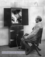
Thomas Wilfred (left, 1889 - 1968), a pioneer in developing what he called Lumia, or the art of light. They've got specific background on Wilfred, including some movies.

The Lumia is in the class of devices called color organs. For some additional details see the AEP's Motion graphics 1961 and Visual music and motion graphics. Here's an excerpt from the latter:

In After Effects, since version 3.1 and the defunct Motion Math, you can synchronize any parameter with any other parameter, so a range of audio effects can be tied to graphic properties to create visual music.

Visual music has a long history in media like color organs, film and abstract animation, light shows, CGI, installation art, and even cave art. Abstract animation is not just eye candy, but often attempts to communicate or stimulate synesthesia or mystical states. While forecasts for an expanded or synaesthetic cinema (PDF) haven't quite come to fruition, motion graphics has. The term seems to have been coined or at least popularized by visual music artist John Whitney, who pioneered motion control cameras and the slit scan technique (showing it to Trumbull and Kubrick) -- and in 1960 named his company Motion Graphics, Inc. SIGGRAPH has a peek at some of his movies.

In addition to the Center for Visual Music, another specific resource for visual music is The iotaCenter. Also noteworthy is the work of William Moritz, who was tireless in documenting early work by abstract animation artists at CalArts and elsewhere and filmmakers like Oscar Fischinger. The Moritz article "Abstract Film and Color Music" in the book The Spiritual In Art: Abstract Painting 1890-1985 (documenting an LA museum show) is quite good. Online, there's a good roundup of color organs and such in Colour and Sound: Visual Music by Maura McDonnell.

October 14, 2009

Effective Information Visualization

via Information Aesthetics... In this 5-minute Ignite talk, interaction designer Matthias Shapiro surveys data visualization techniques that can be used to sort out the information explosion (supporting info is on his blog).

See also, How Might We Visualize Data in More Effective and Inspiring Ways? at Good magazine, Jeffery Veen's talk on Designing for Big Data, and AEP's 37+ data-visualization blogs.